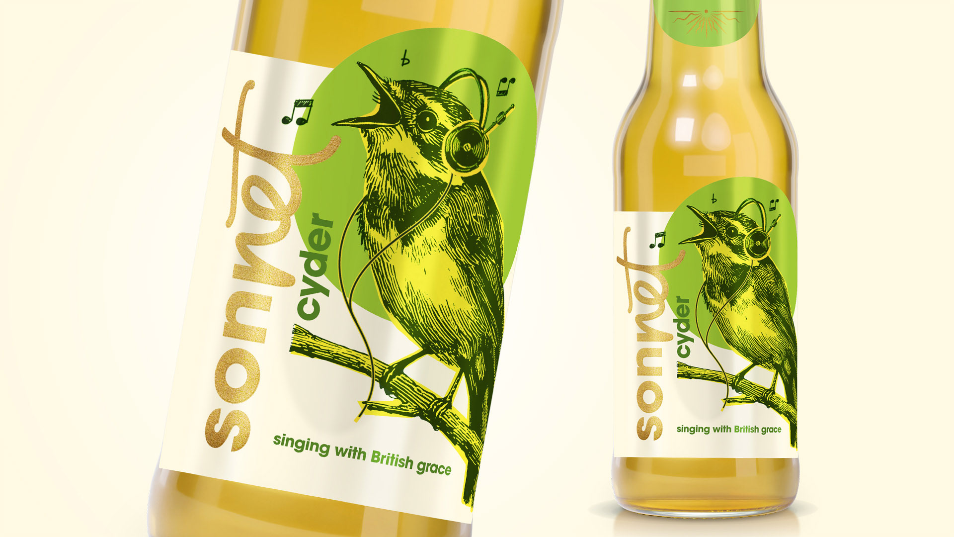
Sonnet Cyder embraces the traditional, historical spelling of “cyder” to stand apart from mass-produced ciders and highlight its artisanal production methods.
Although the brand is heritage-driven, it has to resonate with a younger audience. That’s why the packaging design features linocut-style illustration — a nod to time-honored printmaking techniques — reimagined with a modern, playful twist.
The logotype blends contemporary font with classical script elegance, creating a visual identity that feels both rooted in tradition and refreshingly current.


Designer: Lenka Sobotková
Copywriter: Hana Studeničová